Clean-up man
24/06/13 22:45 Filed in: Technique
Some online posts surprise you. You pour your heart out and get nary a "like." So when I put a BTS of a simple still life shoot on Facebook I was frankly surprised to get a vigorous response to the work.
I then posted a final image and that provoked some conversation as well. I don't pretend to understand how people respond to stuff on Facebook, but the response seemed to demand a more detailed explanation of the strategy I followed in making some industrial packaging for detergent and cleaning products look their best.
I don't do still life photographs very often anymore. One reason is that I do very little work for advertising agencies now, and that's where most of that type of work used to come from.
The other reason has to do with a decision to streamline of my focus, and photographing still life, along with fixing Macs, no longer constituted my idea of a good time. I don't mind doing either, but not as much as I like doing other stuff.
But just like the folks who still come along with a problem they just can't seem to get solved with their Apple gear, there are folks who can still prevail on me to do a still life shoot.
I'm pretty close with the folks who formulate and package these detergents and cleaners, so when the project came along, it quickly became an exercise in craft to highlight all the aspects of the product.
I try not to light because I've got lights available. It's indulgent and often doesn't end up making the product (or the person) the hero, drawing attention to the technique instead of the brand or personality.
I prefer, with both products and portraits, to identify what works for the subject and enhance that while minimizing the bits that don't work quite so well.
Plus there was the issue of my dithering to get the quote done and running down the clock on the project until it was up against the deadline.
So then. Get it done effectively, quickly and attractively.
Normally, you can have any two, but I've got a secret weapon, the musician, artist and digital illustrator Peter Shim with whom I've had the privilege of collaborating with several times over the past two decades.
If you have a copy of the commemorative book produced in honour of the 150th anniversary of Indian Arrival in Trinidad and Tobago, you've got a sample of one of our more extensive collaborations, and it's one that reaches all the way back to the days when I was a pretty decent page layout artist with Quark XPress (something else that I've also set quite firmly behind me).
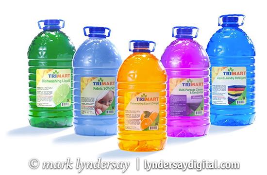
So, on to making great big bottles of detergent look their best.
When I've done this project before for the client, I've done the product groupings on the tabletop but these big bottles demanded individual treatment, which meant compositing, which basically means Peter who does it much better and faster than I do.

The key light source comes in from 135 degrees to the camera's axis and is a gridded spot tightening the beam of light into a 30 degree angle, at that distance effectively a six-inch pool of light that brightens up the liquid and restores the colour the fluid loses to density.
To make the shiny surface you need gleam without sheen, and it's a fine edge with transparent plastic. I used a large soft box from camera left to illuminate the bottle and define its shape.
To put shape to the curve of the upper half of the bottle, there's a 28-inch soft box from above that also put a pretty hefty reflection of itself in the top front of the bottle.

The big light source from camera left doesn't really light the right side of the bottle, so a silver card pops some of that light back into the bottle and gives some defining shape to the right side of the bottle.
The acute angle of the main soft box was blowing out the left edge of the bottle, so there's a black card sitting between the light source and the left edge of the bottle (another gobo) to preserve detail in the bottle's edge on that side.
The 30 individual bottles were shot, retouched for bits of crud and weird bubbles and reflections and the background knocked back to pure white before all the files were Dropboxed to Peter who made a mask, knocked the bottles off the background and merged them into the client's requested groups. He then put the shadows back in; adding a nice color tint to them that I thought was quite a clever touch.
Peter then sent the files back as layered PSD files (now clocking a couple hundred megs) for me to tweak the layouts to my taste before doing flattened versions and delivering the final images to the client.
blog comments powered by Disqus