BitDepth 736 - June 22
21/06/10 19:42 Filed in: BitDepth - June 2010
Microsoft introduces web versions of its productivity software.
The Microsoft Web Apps experience

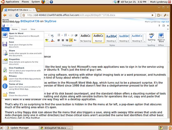
Microsoft’s Web Apps, running in Google’s Chrome web browser, in Ubuntu 9 all in virtualisation on Mac OS 10.6.
Because I'm cussed, it seemed like the best way to test Microsoft's new web applications was take the service right out of it’s comfort zone using Google's Chrome web browser running under Ubuntu 9. That's just the kind of guy I am.
I spend a fair amount of my time using software, working with either digital imaging tools or a word processor, and hundreds of thousands of words later, I'm kind of fussy about the software I use to write.
The first draft of this column was written in the Microsoft Word Web App, which turns out to be a pleasant surprise. It's the first time that I've written in a version of Word since 1998 that doesn't feel like a sledgehammer pressed to the task of swatting a fly.
The software inherits the ribbon bar of its disk based counterpart, and the standard ribbon offers a daunting number of tools for font control, paragraph formatting and styles along with sensibly presented buttons for operations like cut, copy and paste that are useful if there are problems in offbeat browser environments.
That's why it's so surprising to find the large save button hidden in the file menu at far left, a pop-down option that obscures much of the writing area when it's open.
There's a tiny floppy disk icon above the file menu that also triggers a save, along with swoopy little arrows that undo and redo changes (only one in either direction). It’s decidedly odd that these critical icons aren't accorded the same text identifiers that other basic functions get in the toolbar.
The placement makes sense once you realise that you can hide the ribbon bar and get an inch of horizontal space back for your writing, but the icons, while no doubt immediately recognisable to regular Office users, deserve some explicatory text.
And that's where most of the problem lie with the Microsoft Web Apps. They are faithful, detailed replications of the desktop software they are based on, but they run in a browser and have a seriously truncated feature set. Given that, the ribbon bar seems a bit gratuitous, since there isn’t that much to access.
Writing in the software, it's possible to get so immersed in what you're doing that you forget that some keyboard commands like ‘save’ will be passed to the browser, not the web app, so greater clarity and simplicity are all but demanded of the software’s web interface. Treating the web app like a lite version of the desktop product only creates all kinds of quirky productivity problems.
The web software defaults to creating files in Microsoft’s DOCX format, which might complicate matters for users who want to share files with users who have other office productivity products. In the interests of interoperability, an option like Microsoft’s own Rich Text Format would be useful for documents that move in and out of the web interface.
The Powerpoint web app is also surprisingly limited. Basically, you can create slides and put text on them. It’s such a shockingly limited implementation of a presentation package that I’m surprised that Microsoft used the Powerpoint name for it. Even Powerpoint Lite might be pushing it.
That said, there are some curious and interesting additions, like a spell checker that lists 18 versions of English to guide your search for errors, one of which is, evidently, customised for Trinidad and Tobago version of the language.
Setting aside the studious and largely unnecessary replication of the Office interface, Microsoft's Web Apps suite, free on signup to the company's Windows Live services offers capable, if stripped down versions of familiar products at a price that's hard to beat.
You wouldn't want to run a Fortune 500 company using them exclusively, but a small organisation, perhaps even a NGO on a tight budget could set up a very functional document collaboration and distribution system using this online software and the generous 25GB online storage allotment that comes along with it.
Microsoft needs to do some more usability testing, putting common (and in a browser, necessary) tools up front and centre with proper labels setting aside their romance with their toolbar ribbon. This web software suite is a dramatic improvement over an earlier version I tried, but Microsoft may have gone too far in tethering the user experience of the free online software to their paid software.
Anyone who currently uses their desktop Office product will keep butting their heads on the low ceiling of features that characterise this minimalist version of the company's market leading productivity suite.
blog comments powered by Disqus

