BitDepth 815 - January 03
28/12/10 17:55 Filed in: BitDepth - January 2012
New options for news aggregation join Pulse and Condition One's immersive journalism point to new directions for mainstream journalism online.
Curating electronic news

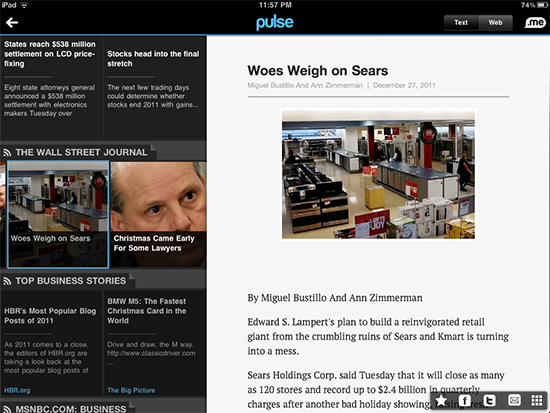
In the face of competition, Pulse (iOS, Android) remains the best and most consistent newsreader for smartphones and tablets.
The real challenge for anyone interested in gathering a daily feed of information from the Internet isn’t content; it’s access and organisation.
Visiting dozens of websites each day gets old quickly and to assist information consumers, the RSS feed format was born in 1999, offering a way of tapping into summaries of new content from a website without actually having to go to the website itself.
Surprisingly, RSS readers have never really caught on. Even Google’s Reader service hasn’t enjoyed the kind of success one might have expected from a company manages information so well.
One of the reasons that traditional news media still enjoys a strong advantage in the face of immediate digital publication is the curatorial character of their information gathering style.
Most consumers have no experience at all trying to organise a global firehose feed of information and while many settle for specific tributaries, there’s still a desire to see what’s happening in more sources of information than it’s practical to handle.
Into this considerable breach came Pulse, the first of a new breed of newsreaders that proved much smarter in their organisation of information and presentation of the links in RSS feeds.
For a while, Pulse reigned as the best way to organise news feeds on the web, its scrolling panes of news bursts and Twitteresque way of dropping old information made picking up a tablet or phone and scanning for information feel very much like a 21st century electronic newspaper.
Pulse now has real competition. Flud and Zite both feed from the same technology trough as Pulse but present their stories in different ways and choosing between them is really a matter of deciding which design solution feels right for you.
Pulse packs the most information in per pixel with a series of compact squares that scroll up to reveal more sources and across to show recent stories.
Zite looks the most like a traditional newspaper, with elegant text on a white background designed with spare good taste. Flud, which wins for the cleverest name, is still very much a design in progress.
Pulse is the most consistent in the way it displays stories. Click on a tile and you get the story in a pane on the right of the app. Zite sometimes does a custom pane and sometimes bounces to a web page in its built in browser.
Flud’s story pane is a bit of a disaster, failing to display pages properly and you will need to click on its “web view” to find anything useful.
These readers all do a good job of pulling together information from different sources, but there are also intriguing initiatives in newsgathering that jump directly from the creator of the work to the viewer.
Quite possibly the best example of this is a new iPad app, Condition One. It’s a media project featuring conflict photographer Patrick Chauvel that makes us of a custom camera rig and some intriguing behind the scenes technologies to create immersive news video.
You begin in a normal enough view, but raising and lowering the iPad and moving it from side to side pans through a 180 degree view of the scene, almost as if the device were a window into the scene.
There’s a clip from Occupy Wall Street, hefty at almost 700MB for a four and a half minute clip that’s being on the front lines of an argument between protesters and police, just without the actual shoving.
It remains to be seen whether this news experience will catch on or become a curiosity for the news saturated.
blog comments powered by Disqus

