BitDepth#828 - April 03
02/04/12 23:26 Filed in: BitDepth - April 2012
Windows 8 and Mac OS X 10.8 make more than nodding moves to acknowledge the growing presence of tablets as an alternative to traditional PC based computing.
Windows to the future

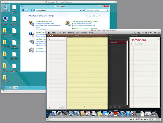
Windows 8 consumer preview and Mac OSX 10.8 under test in Parallels Desktop’s virtual environments.
Both Apple and Microsoft have offered previews of the next major versions of their software in the wild for testing. Mac OSX 10.8, codenamed Mountain Lion, is supposed to be a developer preview, so some enterprise is required to access it.
Microsoft is currently on their second major revision of Windows 8, the successor to 2009’s successful release of Windows 7.
Detailed analyses of what’s different in these two new versions from the long time operating system competitors are readily found online, but how will they work for the average user?
Microsoft has bet big on its future in tablets and touchscreens with Windows 8. On startup, the desktop is dominated by the new Metro interface; a dark green background overlaid with colourful tiles.
The screen begs to be touched, but on a regular PC, the mouse cursor feels like a feeble way to work with these huge tiles and the tile that takes you to the standard Windows desktop is now more prominent and graphically distinct in this version of the OS preview.
A click on that tile takes you into more familiar territory, a desktop environment that looks just like Windows 7, except there’s no Start button.
I’m a pretty confident casual user of Windows and have sometimes dabbled on friend’s systems straightening out minor issues, but I was regularly confused by the disappearance of this cornerstone navigation system on Windows.
Sliding the mouse cursor over the bottom right of the screen pops up some useful navigation tools, but the angry murmurs that have cropped up because of this usability decision were predictable.
Some third party apps can replace some of those functions, but I found it easiest to just open a window and figure out my moves from there.
The Windows 7 style ribbon bar in every window offers tools and path indicators that can help most users find their way around with a reasonable degree of confidence.
A good operating system should provide a platform for software that supports even the least capable of users robustly and invisibly. That was the real magic of Windows 7, which was just familiar enough for holdout Windows XP users to be an acceptable upgrade and just far enough on from the unfortunate experience of Windows Vista for compatibility with old software and hardware to be less of an issue.
With Windows 8, there’s the distinct feeling that Microsoft is pushing the OS into the background and urging its users to work more directly with apps in a tablet style interface.
The Metro way of doing things will work spectacularly on a good Windows tablet, but for traditional PC users, Windows 8 feels like a series of unnecessary hurdles to the flow of muscle memory and workflow familiarity.
Mac OS X Mountain Lion also takes some serious cues from Apple’s thriving tablet business. The company sells way more iPads than desktops and laptops and is clearly planning to build a computing experience that includes many touchstones of its iOS mobile computing platform.
Some of these grace notes seem odd to long time Mac users. Mission Control and Launch Pad, introduced with the current release, 10.7, replicate existing OS functionality with visual metaphors designed for iPad users.
The Mountain Lion preview adds few notable changes. A revamped Notes app, a Reminders app that mirrors the new iPad software, a new notifications system, and a questionable software signing system for software developers.
These OS releases will mark the first point of convergence for OS releases that acknowledge tablets as computing peers and Microsoft and Apple are again tackling the challenge from quite different directions.
blog comments powered by Disqus

