BitDepth#849 - August 28
27/08/12 23:46 Filed in: BitDepth - August 2012
Microsoft overhauls Hotmail and turns out a quite handsome consumer version of Outlook that runs in a web browser.
Microsoft’s tasteful Outlook

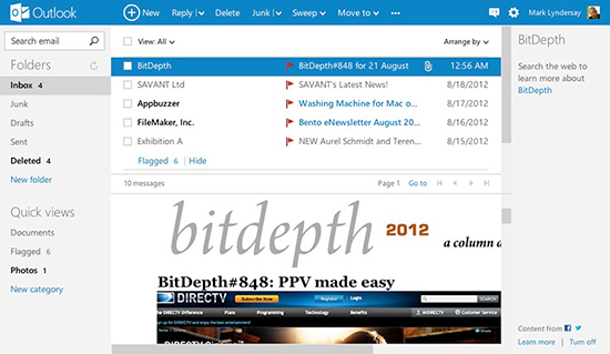
Microsoft's new web-based Outlook.
The decision to upgrade Hotmail users to a new platform was a smart one for Microsoft. The Hotmail service, one of the first widely used web-based e-mail services, had simply accumulated too much negative cruft over the years and the recent Live.com revamp failed to put enough distance between the new effort and Hotmail’s lousy reputation.
Outlook.com Puts some welcome distance between the exhausting clutter of the Hotmail of old and replaces it with a spare and subtle design that puts the focus on reading and organising your e-mail.
It’s a startling improvement on even the Live.com version of Hotmail, which strove mightily to modernise the creaky style of the badly ageing e-mail service. Outlook.com is less an improvement than a reinvention of the company’s public e-mail service and it’s an impressive and elegant experience.
Microsoft’s managed to merge the spare ethos of GMail’s interface with the graphics style it’s been introducing with its newer Metro software for Windows 8 and the result is a web interface for mail that’s mostly usable, delightfully designed and entirely functional. The new mail service is going to fit right in with Windows 8 when it arrives.
Using Outlook.com with your existing e-mail service is also a snap. I connected with one of my lyndersaydigital.com accounts in a matter of minutes, though the mail seemed to arrive sluggishly compared to my desktop client. And yes, you can use a GMail account on Outlook.com. Microsoft clearly wants to woo as many web mail users as possible to what it wants to position as a superior alternative.
There’s an option to switch back to the Live.com version of Hotmail, and I tested it for to be complete, but nobody will want to, trust me on this. If there’s any criticism that might be levelled at Outlook.com, it’s that things are almost too spare.
Too many important bits of text and icons are rendered in a shade of gray that’s so light that on some screens they may well disappear.
This is a welcome change from the company that turned the already out of control feature buttons for its productivity suite into the screen consuming ribbon, a sterling example of clever programming triumphantly trumping usability.
Commands for useful message functions appear as icons only when you roll a cursor over them. If you need to find out what they actually do, you’ll need to move that cursor slowly to see a popup menu that explains their function.
Of the three controls, which Microsoft dubs quick-actions, only delete, the universal trash can, is obvious. The flag icon both marks a message (expected) and moves it to the top of your message list (unexpected), and an almost indecipherable graphic of an open envelope pointing to a closed envelope controls marking a message as read or unread.
Key controls, including marking a message as junk, are in a well-defined row above the message area, but there are strange quirks to the layout. I could never seem to reclaim the 40 or so pixels at the left of the message window (I think it goes away if you turn off social media integration) until I hit the little “door ajar” icon that fills more of the screen. That’s a lot of thinking given the care that’s gone into the interface otherwise.
Social media connectivity options link e-mails to Facebook friends and pop notifications of chat messages on your screen, while the Twitter functionality adds a useful capability to link to a file on your Skydrive online storage and then tweeting access to it.
You can also connect your Outlook.com account to Google, Facebook and Linked-In (Skype’s coming) and create the ultimate unified address book.
The web mail product’s competition is GMail, and it’s leading the charge against that popular service by insisting that it’s mail is private and won’t serve ads on conversation pages. You can get rid of ads entirely by paying US$20 for a pro version that’s still called Hotmail Plus.
Microsoft is also clearly hoping that [email protected] will have more cachet than the now deprecated Hotmail domain. Existing Hotmail users can rename their mail service after switching to the new interface.
Experiencing issues with Outlook.com? Microsoft has a special page set up for issues with the new e-mail service here.
blog comments powered by Disqus

