BitDepth#856 - October 16
15/10/12 22:17 Filed in: BitDepth - October 2012
Using Office 2013 on Windows 8 in a touchscreen environment reveals some clear thinking about how users will interact with Microsoft's productivity suite.
Software for the Modern UI

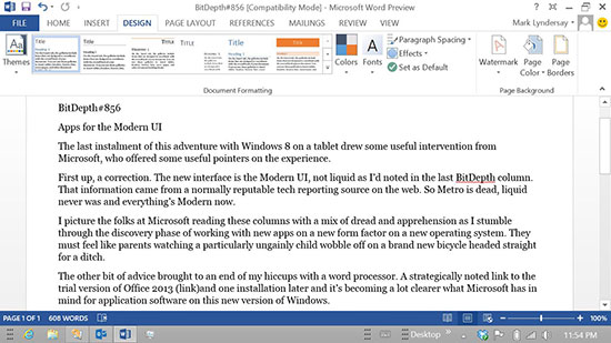
Word 2013’s interface is part of the Modern UI overhaul that’s prepared Microsoft’s productivity suite for Windows 8.
Last week’s instalment of this ongoing adventure with Windows 8 on a tablet drew some useful intervention from a Microsoft representative who offered two useful pointers on the experience.
First up, a correction. The new interface is called the Modern UI, not “Liquid” as I’d noted previously. That information came from a normally reputable tech reporting source on the web. So, to be clear, Metro is dead, liquid never was and everything’s Modern now.
I picture the folks at Microsoft reading these columns with a mix of dread and apprehension as I stumble through the discovery phase of working with the software they’ve spent so much time preparing a new operating system and a new way of working with it.
They must feel like parents watching a particularly ungainly child wobble off on a brand-new bicycle headed straight for a ditch.
The other bit of advice brought to an end of my hiccups with a word processor. A strategically noted link to the trial version of Office 2013 and it’s becoming a much clearer what Microsoft has in mind for application software on this new version of Windows.
So far I’ve only explored Outlook (a look at the web version of Outlook is here) and Word, but the difference in usability from Office 2007 to Office 2013 is staggering. This isn’t an evolutionary change in the way Microsoft is thinking about the way it’s software will be used in a tablet environment, it’s (and I don’t use this term lightly) revolutionary.
As with Outlook for the web, significant work has gone into making the interface and tools of Office apps fade relative to your workspace. Outlook 2013 is all about your message list and message display with tools reduced to gray unobtrusive text. Alerts notifying you about incoming mail when you’re working in other software are equally stylish and discreet, appearing briefly and readably before disappearing.
Word is much of the same. The ribbon’s still around, but the tool buttons and chrome have been considerably simplified and stripped of their skeuomorphic detailing and enlarged for finger targeting. The tools of the ribbon, which slide smartly out of the way when you aren’t using them, become a powerful but concealed armoury for the serious writer.
While you’re working with either Outlook or Word, you can feel the design ethos in play. It’s your content, whitespace and some admirably restrained text that acts as your window to useful robust tools, offering agreeably big targets for your fingertips and a wholly commendable absence of icons.
Both Outlook and Word are very smart about page orientation and the presence of the software keyboard. Tap anywhere in a word processor document while writing and the keyboard appears instantly. Switch from vertical to horizontal mode and the window and keyboard both reorient to fill the screen and maintain your layout.
Outlook cleverly switches from stacked view, message list above, message content below, to panoramic view, both windows side by side, when you rotate the screen from vertical to horizontal.
While writing this column, I also found inline editing much easier with Word 2013. There are a lot of useful contextual touches that pop up while editing. Touch an obvious error, like two words concatenated, and the resulting popup jumps to a sensible correction suggestion.
In the way it integrates into the Modern UI and anticipates the way you might want to work on a tablet, this version of Word ranks among Microsoft’s finest releases, comparable to the defining elegance, in its day, of Word 5.1 for the Macintosh.
The difference between working with Office 2007 and Office 2013 in Windows 8 on a tablet is so vast that I can only suggest, quite strongly, that if you plan to use Windows 8 on a tablet PC with Microsoft’s productivity suite that you budget for the latest version.
In this environment, it’s a must have upgrade.
Everything you might ever want to know about the launch of Windows 8 is linked here…
BitDepth#859, Expect Turbulence
Business Guardian report on the Latin American Launch of Windows 8
BitDepth#858, Microsoft: All In
Working with Windows 8 on a tablet device...
BitDepth#857, Is it the tablet PC's time?
BitDepth#855, Tailoring a Tablet-ready Windows
BitDepth#854, Windows 8 on a Slate
blog comments powered by Disqus

