Making "A Tomb for the Imam"
14/06/08 18:45 Filed in: How

Creating a Local Lives essay means engaging people, not one of my natural strengths.
I'm a disaster at first impressions. I actually only really get going somewhere around on the third or fourth meeting, so creating an essay either means working at it fast and hard, which was typical of the first three instalments or being patient.
But as I mature with the project, I realise that slowing down and taking my time can be even more rewarding (yes, I know how it sounds).

That proved to be as much a curse as it was a blessing.
The photography, much of it in the enclosed space of the Imambara generated more than 1,500 images, which I edited down to just over 500 as my first edit.
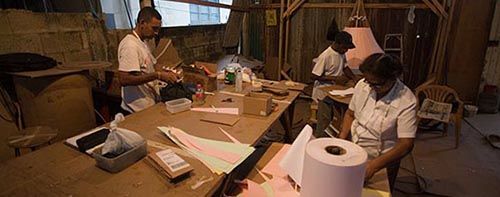
The picture above was from my first encounter with the people of the Panchaiti yard, and it is a kind of warm-up, a declaration of what is to follow. Nothing from that first shoot even made it to the first edit.
Moving from the final take to the published piece is one of the most difficult experiences I face working on a Local Lives project.

I use Apple's Pages for this, because that's what I use for word processing, but the software has a useful "masking" feature that allows me to crop images to fit.
This is where the essay really comes together for me, and I can see if a narrative is really taking shape.
I will sometimes find that something isn't working out at all and return to the original pool of images to find a better image.

For "Imam" the process of whittling down the first selects to placed images on the page was particularly difficult.
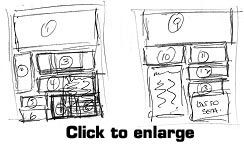
In the sketch above, you see the changes I made at the bottom right of page one, changes which continued through to the final layout.
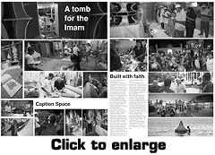
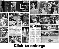
Below my crude rough is the final piece, paginated by the Guardian's Dexter Solomon.
I usually sit with a mamber of the Guardian's design team to finesse the final crop of images and to reslve problems when my rough layout is rebuilt in Quark Xpress.
A downloadable version of the final layout in PDF format is available here.
blog comments powered by Disqus