Photoshop: Metamorphosis
16/05/11 22:20 Filed in: Technique

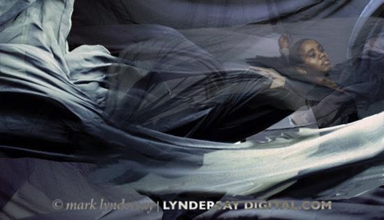
The poster for Celebrations, the 1997 Metamorphosis presentation. Photography by Mark Lyndersay.
In 1996, my good friend Peter Shim came to me with an excellent opportunity. His wife was working on the launch of a dance company, meant to be the graduating class company for the Caribbean School of Dancing to be called Metamorphosis.
The company would be having their first show in a few weeks and needed an image to launch the company.
That was a heady time for computing. Macs were finally getting fast enough to keep up with serious graphics and image files, and hard disks were getting cheap enough to buy drives with hundreds of megabytes, hundreds, I say, worth of space.
I was working at the time with a Mac IIci sporting a PowerPC accelerator card and a whopping 64MB of RAM, 16 MB of which were 1MB chips sitting on a special riser card that allowed you to reuse older RAM, four chips at a time.
Peter had a PowerPC 7100, which was one of the first models with that chip on the market. We also had a terrifyingly expensive Micronet 2X CD Burner, which was originally a 1X model, but since that never worked, the company caved in and sent us their brand-new model after some testy phone calls in which we explained the kind of duty we were paying on these devices when they were shipped in.
Using that hardy, souped up Mac, with my first shrinkwrapped copy of Photoshop 3, it was possible to start doing some of the fancy stuff that was so popular in all the colour magazines of the day.
Peter and I would collaborate on six of these posters for Metamorphosis in all and they were fun to do. We’d talk through the image, figure out how to shoot it and then I’d block out the image in Photoshop before handing it off to Peter to finesse (or repair, depending on your perspective) the retouching and add the typography.
This experience taught me a lot about using Photoshop, and more compellingly, it taught me just how deep the software was. My background was decades spent in a darkroom and Peter’s was with pencils and paint and our approaches to the same image and software was shockingly different.
It was normal in those days for one to look over the shoulder of the other and ask politely, “What are you doing?”
I used selections and feathering a lot; the digital analogue of the burning and dodging I’d been doing for years, while Peter favoured the brushes and pen tools. Kind of vividly logical when you think about it in hindsight, but we’d both been working with the software for a couple of years before realising the way we did things was so completely different.
The key image leading off this post was the second image we did for Metamorphosis. In the first few images of the series, I was wrestling with portraying the dynamism and movement of dance in a still photo and cloth seemed to be an interesting way to portray the feel of speed and movement that these young dancers traded in so effortlessly.
For the second photo, we got some light grey cloth into the studio and shot it repeatedly on 6x6 colour transparency film. I scanned several promising images and layered them together to build the effect.
We’d used cloth on the first image as well, asking dancer Zara Bartels to jump repeatedly on a trampoline with a red cloth. And just for the record, the cloth was plain red and her leotard was black before we got to work on the project.
Eventually, the project would run its course. Colour posters are expensive to produce and the ideas began to run dry. And personally, I finally jumped the shark on the project with the fifth poster, which resulted in this image.
Mercifully, it got axed as a possible image and I reduced the photo down to the core photo of Abby Charles, sister of Ettiene, who had appeared in most of the images in the series. That turned out to be quite popular, actually.
The series was a wonderful opportunity for me, to fully explore what was possible with images in Photoshop and to push the limits on what I wanted to do with the software and more important for the world, I think, what I shouldn’t be doing with it.
As it turns out, all that work with selections and the excellent experience of working with Peter Shim refined in my mind exactly what Photoshop work would become part of my workflow and what I wouldn’t be doing.
I actually do quite a bit of work on some of the images I do these days, but if I do my work well, nobody should ever see it. That’s become my style, after all the enthusiasm I put into filters and layering and general messing about with Adobe's software, but I had to go through my own Metamorphosis to get there.
blog comments powered by Disqus
