Channelling Penn for Pierrot
08/09/08 19:52 Filed in: Technique
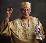
If these photographs look a little familiar, it's because they should. The photographic style is a shameless ripoff homage of Irving Penn's early portrait lighting, later made into a career by William Coupon and Norman Seeff.
It isn't particularly complex technically, being window light stripped to its basics.
That simplicity makes special demands on the photographer-subject relationship and photographs can be successful or utterly uninteresting as a result of the quality of that interaction.
Gayelle offered me a small space just off the main studio where the presentations were being done. I was able to liaise with the production staff to set up a flow directly off the camera stage to my little studio setup and back to their seats.
Adding a wrinkle to the plan was the fact that the official awards were not ready for showtime, so two previous awards were used for the presentation and part of my job was to "invite" the freshly awarded recipients to lend their awards back to the production staff for on-camera recycling. That's why the awards have that alarming red tape strip which you can't help seeing once I've mentioned it.
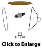
The setup was pretty simple. A folding painted backdrop provided the background and another reversible (black/white) unit was placed white side out to the left of the shooting space. Only one light was used to the right, a White Lightning 1600, throttled down to quarter power and pumped into a large 52 inch square softbox provided the main light.
On average, I had two minutes with each subject, inclusive of explanation, posing and shooting. This dovetailed nicely with the reduced power, which allowed for brisk recycling times and fast shooting. The relatively low light output (f7.1) made the background nice and soft.
These photos are now the inaugural exhibit in my first "Virtual Gallery" collections of images in extra large format that I'm offering as an alternative to meatworld showings.
blog comments powered by Disqus