Theron theory
22/08/08 23:11 Filed in: Technique

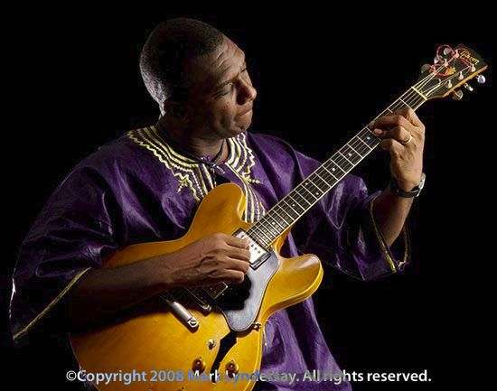
Theron Shaw, photography by Mark Lyndersay.
Ace jazz guitarist Theron Shaw visited the studio to consult on his new CD. Like every artist with a product on the shelf, he wanted an album cover that would make people stop, look and purchase. Given the nature of the jazz market, which focuses on appreciation of an individual's talents, we agreed that putting him on the cover was our best bet.
I wanted to capture some of the introspection and passion he brings to his playing, the delicate symbiosis between performer and instrument that inspires non-players to the adventures of air guitar.
Theron is the real thing, and he's too busy working his frets to engage in antics onstage.
We shot a few variations on the theme of musician making music, but the image on the cover was always the one I envisioned for the cover.

I'm hoping that Theron goes to electronic distribution with this album, which makes a simple, easy to read image particularly crucial, since album images have now effectively shrunk from 12 inches to five inches and now down to just about an inch square in software that previews album art on a computer or MP3 player.
Since the pose was going to be relatively passive, the image had to pop though light. I opted for a dramatic, controlled staging of the scene.
The lighting plan is keyed with a large softbox just a few angles wider than 90 degrees to the camera position at right. This offered broad illumination to the subject but threw much of his left side into deep shadow.

To bring the focus subtly in on the business at hand, I used a single light with a 20 degree grid almost directly over the camera position to brighten his left hand as he plays.
In the final image, which will have to be readable at the size of this thumbnail, artist Richie Joseph, an old school friend and fine designer, has replaced the black background with a nice blue glow that lifts the final art nicely.
blog comments powered by Disqus